Quick Menu
Plugin Elana Shortcodes
Elana Shortcode Plugin
About
The Elana Shortcode plugin provides several useful UI elements for Grav as shortcodes. As such it requires the Shortcode Core plugin to function.
It currently provides:
- Switcher
- Alert
- Gallery
- Image
- Maps
- Columns
- Youtube
- Countdown
Installation
Typically a plugin should be installed via GPM (Grav Package Manager):
NOT AVAILABLE
Alternatively it can be installed via the Admin Plugin
Configuration Defaults
There is currently only one main plugin option for Elana Shortcode and that is to set a default theme for the tabs shortcode. As this plugin requires the Elana Shortcode functionality there are some configuration options there that will effect this one. For example setting the default active state to false will also cause this plugin to not function.
enabled: truePer-Page Configuration
Available Shortcodes
This plugin provides a variety of plugins, each with a specific purpose:
Switcher
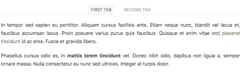
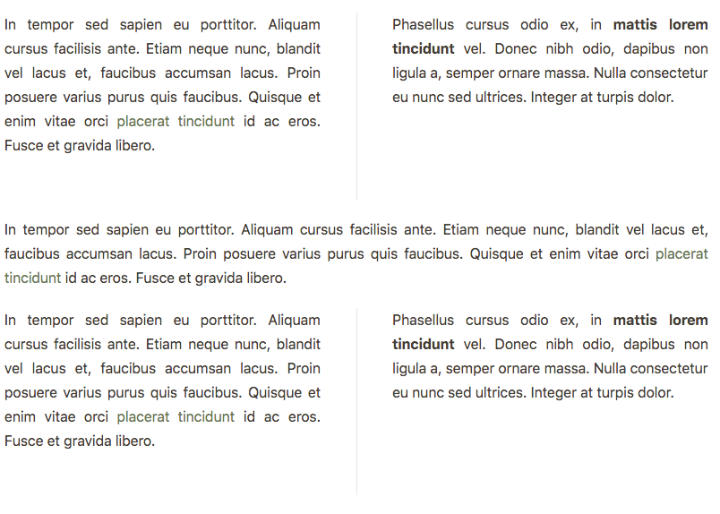
An example of the Tabs shortcode is as follows:
[ui-switchers tab="1" anim="fade" align="center" button="0" color="primary"]
[ui-switcher title="First Tab"]

In tempor sed sapien eu porttitor. Aliquam cursus facilisis ante. Etiam neque nunc, blandit vel lacus et, faucibus accumsan lacus. Proin posuere varius purus quis faucibus. Quisque et enim vitae orci [placerat tincidunt](#) id ac eros. Fusce et gravida libero.

Phasellus cursus odio ex, in **mattis lorem tincidunt** vel. Donec nibh odio, dapibus non ligula a, semper ornare massa. Nulla consectetur eu nunc sed ultrices. Integer at turpis dolor.

[/ui-switcher]
[ui-switcher title="Second Tab"]

In tempor sed sapien **eu porttitor**. Aliquam cursus facilisis ante. Etiam neque nunc, blandit vel lacus et, faucibus accumsan lacus. Proin posuere varius purus quis faucibus. [Quisque et enim](#) vitae orci placerat tincidunt id ac eros. Fusce et gravida libero.

Phasellus cursus odio ex, in mattis lorem tincidunt vel. [Donec nibh odio](#), dapibus non ligula a, semper ornare massa. Nulla consectetur eu nunc sed ultrices. Integer at turpis dolor.

[/ui-switcher]
[/ui-switchers]
The [ui-switchers] shortcode has some optional parameters:
tabTab effect can betrueorfalse- (true by default)animsmooth animations can befade,scale-up,scale-down... (fade by default) See all kind of animalignmodify the alignment of the navigations, can beleft,rightorcenter(center by default)buttonButton style can betrueorfalse- (false by default)colormodify the button's style, can beprimary,secondaryorcenter(center by default)
The [ui-switcher] shortcode that defines each tab has the following parameters:
title- The text to display for the actual tab title
You can use whatever markdown you wish in the tab itself. They are auto-adjusting and fully responsive.
Example
Alert
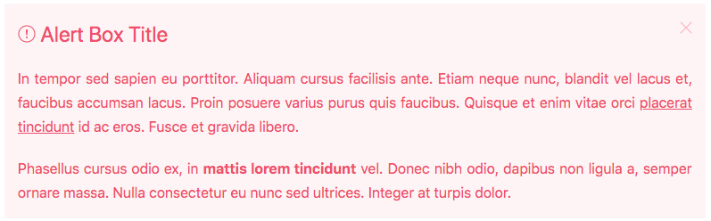
An example of the Alert shortcode is as follows:
[ui-alert title="Alert Box Title" close="1" color="danger" padding="small" style="h3" icon="warning"]
In tempor sed sapien eu porttitor. Aliquam cursus facilisis ante. Etiam neque nunc, blandit vel lacus et, faucibus accumsan lacus. Proin posuere varius purus quis faucibus. Quisque et enim vitae orci [placerat tincidunt](#) id ac eros. Fusce et gravida libero.

Phasellus cursus odio ex, in **mattis lorem tincidunt** vel. Donec nibh odio, dapibus non ligula a, semper ornare massa. Nulla consectetur eu nunc sed ultrices. Integer at turpis dolor.
[/ui-alert]
The [ui-alert] shortcode has some optional parameters:
title- The text to display for the actual Alert box titleclosecreate a close button and enable its functionality can betrueorfalse- (true by default)styleThere are several style modifiers available, can bediv,p,h1toh6(h3 by default)paddingadd spacing, can besmallorlarge(small by default)colorThere are several style modifiers available, can beprimary,success,warningordanger(center by default)iconadd scalable vector icons, can beuser,home,lock... (none by default) See all kind of icons
Example
Gallery
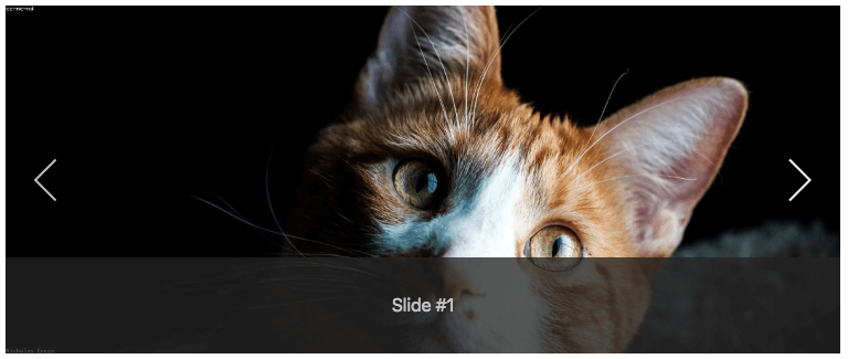
This shortcode create a responsive slideshow. The Slideshow component is fully responsive and supports touch and swipe navigation as well as mouse drag for desktops.
[ui-gallery contrast="1" navlarge="1" autoplay="1" padding="small" caption="1" ratio="12:5"]
[ui-slide title="Slide #1"]

[/ui-slide]
[ui-slide title="Slide #2"]

[/ui-slide]
[/ui-gallery]contrastapply a light or dark color for better visibility, can betrueorfalse- (false by default)navlargeincrease the size of the slidenav icon, can betrueorfalse- (false by default)ratiothe height adapts according to the defined ratio, can be4:3... - (16:9 by default)captionadd slide caption (overlay), can betrueorfalse- (true by default)paddingadd spacing, can besmallorlarge(small by default)autoplayautoplay the gallery, can betrueorfalse- (false by default)
The [ui-slide] shortcode that defines each slide has the following parameters:
title- The text to display for the actual slide caption
Example
Image
This shortcode display an image with our without a responsive lightbox.
[uikit-image shadowbottom="1" lightbox="1" padding="small" shadow="small" caption="Image Caption"]

[/uikit-image]The [ui-image] shortcode has some optional parameters:
lightboxcreate a responsive lightbox can betrueorfalse- (true by default)paddingadd spacing, can besmallorlarge(small by default)shadowbottomApply a box shadow at the bottom of map,can betrueorfalse- (true by default)shadowapply different box shadows to map, can besmall,medium,largeorxlarge(small by default)figcaptiondefines a caption for imagecopyrightdefines a copyright for imagecopyright-linkAdd an URL to copyright
Example

Maps
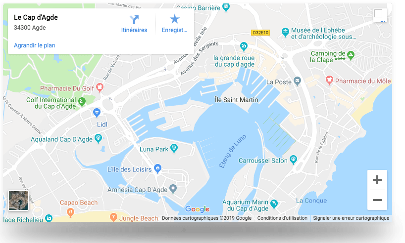
This shortcode show a Google Map through API.
[ui-maps shadowbottom="1" shadow="small" place="cap d’Agde" maptype="roadmap" zoom="15" lang="fr"][/ui-maps]langcustomize your map for a specific country. - (fr by default)zoomzoom level of map. Use number. - (13 by default)maptypeapply different map type, can beroadmap,satellite,hybridorterrain(roadmap by default)placeAdress of you locationshadowbottomApply a box shadow at the bottom of map,can betrueorfalse- (true by default)shadowapply different box shadows to map, can besmall,medium,largeorxlarge(small by default)
Example
Columns
This shortcode sisplay your content in multiple text columns.
[ui-columns small="1" medium="1" large="2" xlarge="3"]
[ui-column]
In tempor sed sapien eu porttitor. Aliquam cursus facilisis ante. Etiam neque nunc, blandit vel lacus et, faucibus accumsan lacus. Proin posuere varius purus quis faucibus. Quisque et enim vitae orci [placerat tincidunt](#) id ac eros. Fusce et gravida libero.

Phasellus cursus odio ex, in **mattis lorem tincidunt** vel. Donec nibh odio, dapibus non ligula a, semper ornare massa. Nulla consectetur eu nunc sed ultrices. Integer at turpis dolor.
[/ui-column]
[/ui-columns]xlargenumber of responsive column, can be1to6- (1 by default) - Only affects device widths of 1600px and higherlargenumber of responsive column, can be1to6- (1 by default) - Only affects device widths of 960px and highermediumnumber of responsive column, can be1to6- (1 by default) - Only affects device widths of 1200px and highersmallnumber of responsive column, can be1to6- (2 by default) - Only affects device widths of 640px and higherdividerdisplay a vertical line between column, can betrueorfalse- (true by default)
The [ui-column] shortcode that defines each column has the following parameters:
spanTo have an inline element span the whole width of the columns, can betrueorfalse- (false by default)
Example
Youtube
This shortcode embed a responsive Youtube video, can be inside a responsive lightbox.
[ui-youtube id="11Wh8RzcQZr4" lightbox="1" automute="1" autoplay="1" padding="small" btnlabel="Video Caption"][/ui-youtube]idYoutube video IDlightboxcreate a responsive lightbox can betrueorfalse- (false by default)autoplayautoplay the video, can betrueorfalse- (false by default)automuteautomute the video, can betrueorfalse- (false by default)paddingadd spacing, can besmallorlarge(small by default)btnlabeldefines a button label to open a lightbox
Example

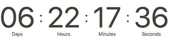
Countdown
This shortcode create a simple countdown timer.
[el-countdown date="2019-04-19T06:25:43+00:00" separator="1" dayslabel="Days" hourslabel="Hours" minuteslabel="Minutes" secondslabel="Seconds"][/el-countdown]datedefine a date when the countdown should expireseparatorinsert a separator between each number, can betrueorfalse- (true by default)dayslabelDays labelhourslabelHours labelminuteslabelMinutes labelsecondslabelSeconds label
Date Format
Just add date: YYYY-MM-DDThh:mm:ssTZD option to the attribute, using the ISO 8601 format, e.g. 2017-12-04T22:00:00+00:00 (UTC time).
You can use this generator timestampgenerator
Example
Found errors? Think you can improve this documentation? Simply click the Edit link at the top of the page, and then the icon on Github to make your changes.